Request your free copy now
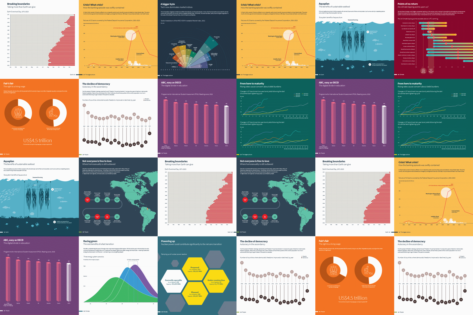
Our annual showcase of the most beautiful, concise and informative published over the past year, The Little Book of Data aims to provide investors with a different perspective on the world and help guide their decisions.
The power of visualising data in innovative ways cannot be understated. Part art, part science, it requires an expert instinct for understanding what matters most; the skill being as much in what you leave out as what you present.
In investing, as data and information expand at an ever-increasing rate, the importance of visualising data accurately and engagingly will only grow. Not only does it help drive efficiency and reduce cognitive load (by helping people understand important trends and concepts more quickly), it can also help create entirely new perspectives.
As with the last three editions of The Little Book of Data, we have curated some of the best and most informative charts over the last 12 months; the ones that, as well as being visually arresting, speak to the most pressing issues of the day.
Themes covered in this edition of include:
- The bigger picture
- COVID-19
- Data and technology
- Sustainability
- Diversity and inclusion
- Markets and economies
A beautifully printed coffee table book
Over 120 pages of full colour spreads showing stunning data visualisations covering topical themes from across the world.

Against our nature
Through visual design and simple but provocative messaging, Against our nature aims to playfully remind people of their part in the climate crisis and help them navigate the myriad of psychological and behavioural traps that lie in wait for them.

Data visualisations

What does the data say? Are we close to 1970’s-style stagflation?
29 Jul 2022
In this month’s instalment of our visual series on topical themes, we look at whether the global economy is heading towards stagflation.
Read more

What does the data say? Biodiversity loss: From horror to hope
24 Jun 2022
In this month’s instalment of our visual series on topical themes, we explore the world of biodiversity.
Read more

Deep water: Ten threats to marine ecosystems
8 Jun 2022
Our air, weather, food, the health of diverse marine life and millions of jobs all depend on the ocean. But we have not done well as custodians of marine ecosystems. Here, we set out ten ways where human actions threaten the health of an essential environment.
Read more

What does the data say? Where have the safe havens gone?
27 May 2022
In this month’s instalment of our visual series on topical themes, we look at how various asset classes are holding up in a turbulent year for financial markets.
Read more

What does the data say? Ukraine-Russia: The human and economic costs of war
29 Apr 2022
In this month’s instalment of our visual series on topical themes, we look at the far-reaching human and economic consequences of the Ukraine-Russian war.
Read more

What does the data say? Credit in focus
31 Mar 2022
In this month’s instalment of our visual series on topical themes, we look at key trends in the credit market.
Read more

What does the data say? ESG in focus
25 Feb 2022
In this month’s instalment of our visual series on topical data themes, we look at some of the major ESG trends and metrics of the last few years.
Read more

What does the data say? Eight charts on supply chain disruption
28 Jan 2022
In this month’s instalment of our visual series on topical data themes, we focus on the implications of continued disruption to supply chains.
Read more

What does the data say? Parcels, the (other) Amazon and COVID-19
26 Nov 2021
In this month’s instalment of our visual series on topical data themes, we look at the steep increase in deliveries, the continued deforestation of the Amazon rainforest and the rise of COVID-19 in Europe.
Read more

What does the data say? All eyes on Glasgow
29 Oct 2021
In this month’s instalment of our visual series on topical data themes, we focus on climate change as the world turns its attention to the COP26 summit in Glasgow.
Read more

What does the data say? Ice meltdown, unicorns and green pensions
23 Sep 2021
In this month’s instalment of our visual series on topical data themes, we look at melting ice caps, the rising value (and volume) of ‘unicorn’ companies, and the hidden power of your pension.
Read more

What does the data say? Climate change, real yields and live TV
27 Aug 2021
In the latest instalment of our visual series on topical data themes, we look at the latest IPCC report, the significant decline in US real yields and people’s live TV versus streaming habits.
Read more

What does the data say? Dogecoin, Nike D2C and the North American heatwave
30 Jul 2021
In this month’s instalment of ‘What does the data say?’, we look at the incredible rise of Dogecoin, Nike’s direct-to-consumer strategy and the highest temperature ever recorded in Canada.
Read more

COVID’s dirty plastic secret
29 Jul 2021
As the world continues to grapple with the health implications of COVID-19, unintended consequences were inevitable. In this data-led story, we look at the effect the pandemic has had on global plastic wastage and what policymakers can do to tackle the issue.
Read more

Climate technologies
8 Jul 2021
No single technology is enough to tackle the climate crisis, a global and systemic issue that requires joined-up thinking. We flag different pathways to address warming gases in the atmosphere – five nature-based and five technical – and ask what steps are needed next.
Read more

What does the data say? Corporate tax, climate litigation and pub blues
25 Jun 2021
In this month’s instalment of our visual series on topical data themes, we look at corporation tax rates, climate-related litigation and the ongoing misfortune of pubs.
Read more