
In the sixth edition of our award-winning series, we use data visuals, charts and graphics to illustrate the forces shaping our world, from inflation and artificial intelligence to climate change and geopolitics.
“It is a capital mistake to theorise before one has data. Insensibly one begins to twist facts to suit theories, instead of theories to suit facts”
This quotation, from Arthur Conan Doyle’s master detective Sherlock Holmes, neatly illustrates why it is important to ensure research starts with data.
But data is not enough on its own. To be valuable, it must be organised and presented clearly and accurately. Good data visualisation can help with this, by illustrating important themes and highlighting overlooked trends.
The graphics in The Little Book of Data make us stop and think. They challenge our preconceptions and prompt us to consider key market themes from a fresh perspective.
Most important of all, they help ensure we always adapt our theories to suit the facts – and not the other way round.
We hope you enjoy the sixth edition.
Download The Little Book of Data to understand:
- Key developments in economies and markets
- The risks and opportunities associated with the climate transition
- Why investors should pay attention to biodiversity and social issues
The Little Book of Data 6
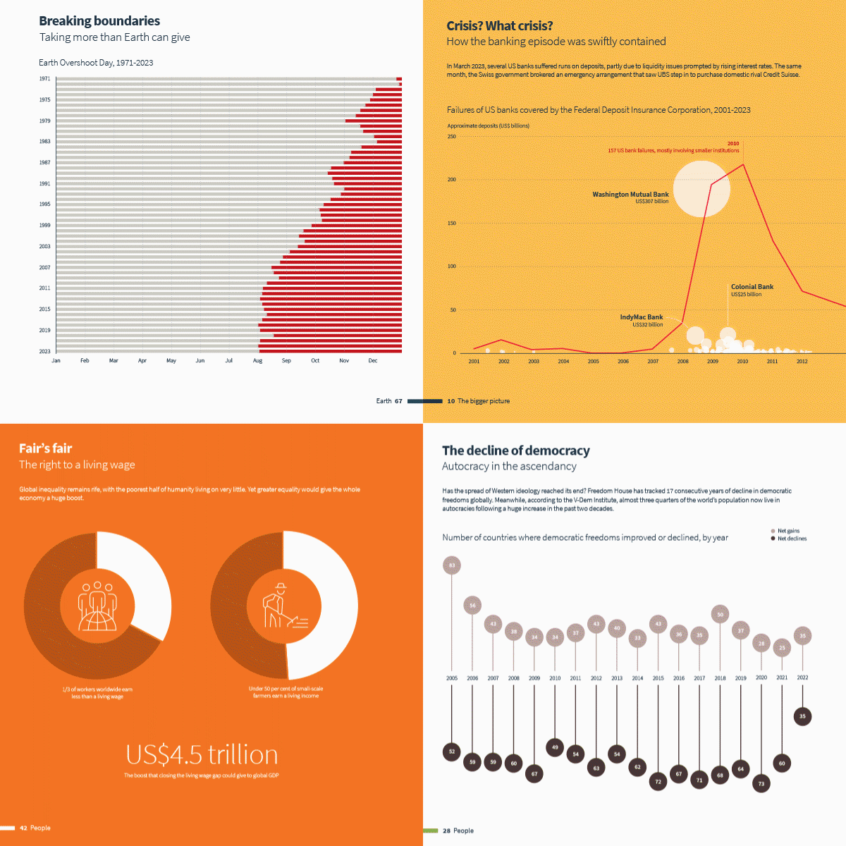
The sixth edition of The Little Book of Data presents original and curated visuals, charts and graphics to offer a fresh perspective on topics shaping our world, including climate change, artificial intelligence, inflation, economics and geopolitics.
Recognition for The Little Book of Data
Content Marketing Awards
Visual Storytelling, Best Infographic Series – 2022
Investment Marketing and Innovation Awards
Content Marketing of the Year – 2021
“Boring, made beautiful. The attention to detail and tenacity is commendable”
Global Creative Director, Bloomberg
Creativepool Annual 2020
Publishing, People's choice – 2020
Financial Services Forum Awards
Judges Award for Marketing Learning – 2019
Previous editions

The Little Book of Data 5
The fifth edition of The Little Book of Data looks at the social and economic impact of conflict, rising inflation and the climate crisis.

The Little Book of Data 4
The fourth edition of The Little Book of Data delves into the escalating climate crisis and the going impact of the pandemic.

The Little Book of Data 3
The third edition of The Little Book of Data explores the COVID-19 pandemic, environmental sustainability and the battle for social equality.

The Little Book of Data 2
The second edition of The Little Book of Data discusses climate modelling, urbanisation and the financial implications of retirement.

The Little Book of Data 1
The first edition of The Little Book of Data explores demographics, tech, trade wars and the impact of Brexit.
Subscribe to AIQ
Receive our insights on the big themes influencing financial markets and the global economy, from interest rates and inflation to technology and environmental change.

Related content you might also like
-

What does the data say?
What does the data say? Five charts for multi-asset investors
9 Aug 2023
We take a visual approach to explain what’s happening with UK inflation, web traffic for ChatGPT and Threads, and the slower-than-expected recovery of China’s economy.
-

Equities
What does the data say? Three charts for multi-asset investors
19 Jun 2023
We take a visual approach to explain what’s happening with the US debt ceiling, LVMH and gold.
-

Economic Research
What does the data say? Five charts on financial fragilities
14 Apr 2023
We take a visual approach to explain what’s happening with banks.
-

Equities
What does the data say? Three charts multi-asset investors should know about
6 Mar 2023
We take a visual approach to explain what’s happening with bonds, equities and oil.
-

Economic Research
What does the data say? Politics and markets
11 Nov 2022
In this month’s instalment of our visual series on topical themes, we look at how political events have shaped markets in 2022 and further back in time.
-

Fixed income
What does the data say? Are we close to 1970’s-style stagflation?
29 Jul 2022
In this month’s instalment of our visual series on topical themes, we look at whether the global economy is heading towards stagflation.
-

Responsible Investing
Deep water: Ten threats to marine ecosystems
8 Jun 2022
Our air, weather, food, the health of diverse marine life and millions of jobs all depend on the ocean. But we have not done well as custodians of marine ecosystems. Here, we set out ten ways where human actions threaten the health of an essential environment.


